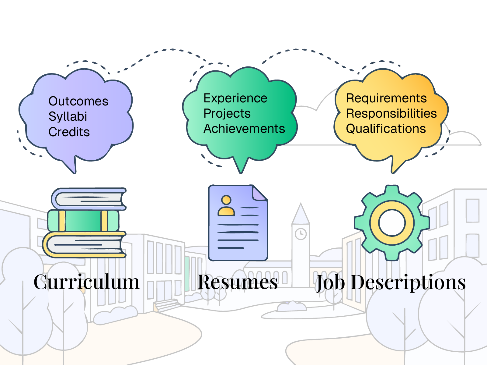
Build Programs That Perfectly Match Employer Demand
Turn your curriculum into a competitive advantage. We translate your courses into actionable skills data so you can adapt faster, secure accreditation, and graduate highly hirable students
- Extract skills directly from course syllabi
- Visualize strengths and gaps across your curriculum
- Align to careers, workforce demand, or accreditation expectations
- Compare sections, certificates, and degrees side by side
- Move from insight to structured curriculum updates
Curriculum Design Shouldn't Be a Guessing Game.
Curriculum teams are expected to improve outcomes, align to careers, and satisfy accreditation - without a clear view of what the curriculum actually builds.
Program chair / curriculum committee
A program review meeting to decide what to update before the next catalog cycle.
“Course titles, descriptions, and learning outcomes across the program, plus scattered feedback and labor market links - but no consistent, skills-level view of strengths and gaps.”
- Collect syllabi and outcomes from faculty across multiple sections
- Compare courses manually to find overlap and missing coverage
- Pull job postings or labor data separately to guess what to prioritize
- Debate changes without shared evidence of what students actually gain
Curriculum improvement lacks a common language.
Courses, sections, and programs are described in narrative form across departments and systems. Labor market expectations and accreditation standards are interpreted separately. Without a common language to discuss what the curriculum actually builds, improvement efforts become manual, fragmented, and difficult to scale.
- No shared way to describe what students actually learn
- Overlap and gaps are identified through manual comparison
- Career expectations are discussed separately from curriculum content
- Accreditation mapping requires one-off interpretation and documentation
- Improvement decisions rely on judgment rather than structured evidence
Turn curriculum review into a skills-based process.
Skills become the common language for identifying strengths, gaps, and high-impact changes across courses and programs.
Translate curriculum into skills
Courses, sections, and program requirements are extracted and translated into a structured skills profile.
Curriculum-to-skills extraction and normalization
The curriculum is no longer described only in narrative form - it is expressed in a structured, comparable way.
Visualize strengths and overlap
Skills coverage is aggregated across courses and sections to show depth, redundancy, and concentration.
Skills coverage and overlap analysis
Strengths become visible and measurable instead of anecdotal.
Reveal gaps against targets
Program skills are compared to target careers, workforce demand, or accreditation expectations.
Skills-based gap analysis
Gaps are identified structurally, not through manual cross-checking.
Prioritize curriculum updates
High-impact skill additions or adjustments are surfaced based on alignment and demand.
Actionable curriculum recommendations
Curriculum change moves from debate to evidence-backed prioritization.
Skills become the common language
Faculty, chairs, and leadership use the same structured skills framework to review and improve curriculum.
Shared skills intelligence across stakeholders
Improvement becomes repeatable, defensible, and scalable across the institution.
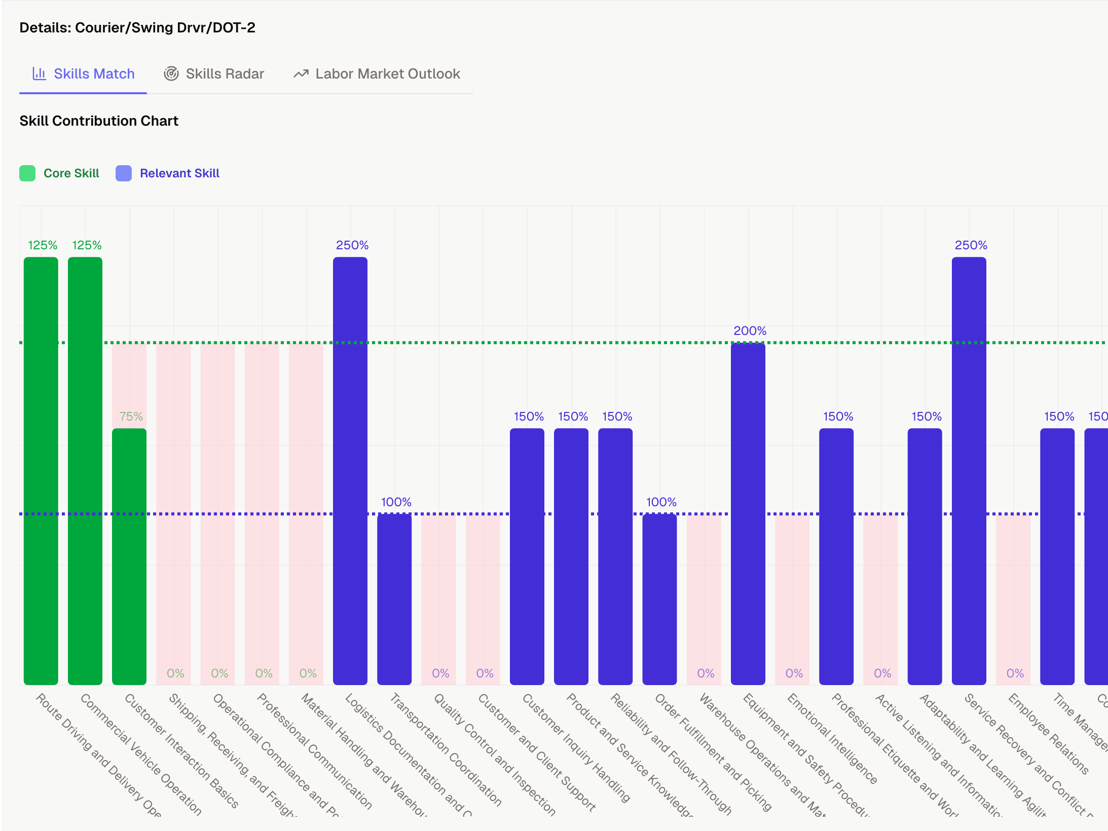
A clear, skills-based curriculum review view.
This is the artifact used in curriculum review meetings. Strengths, gaps, and alignment to target careers are visible in one structured view.
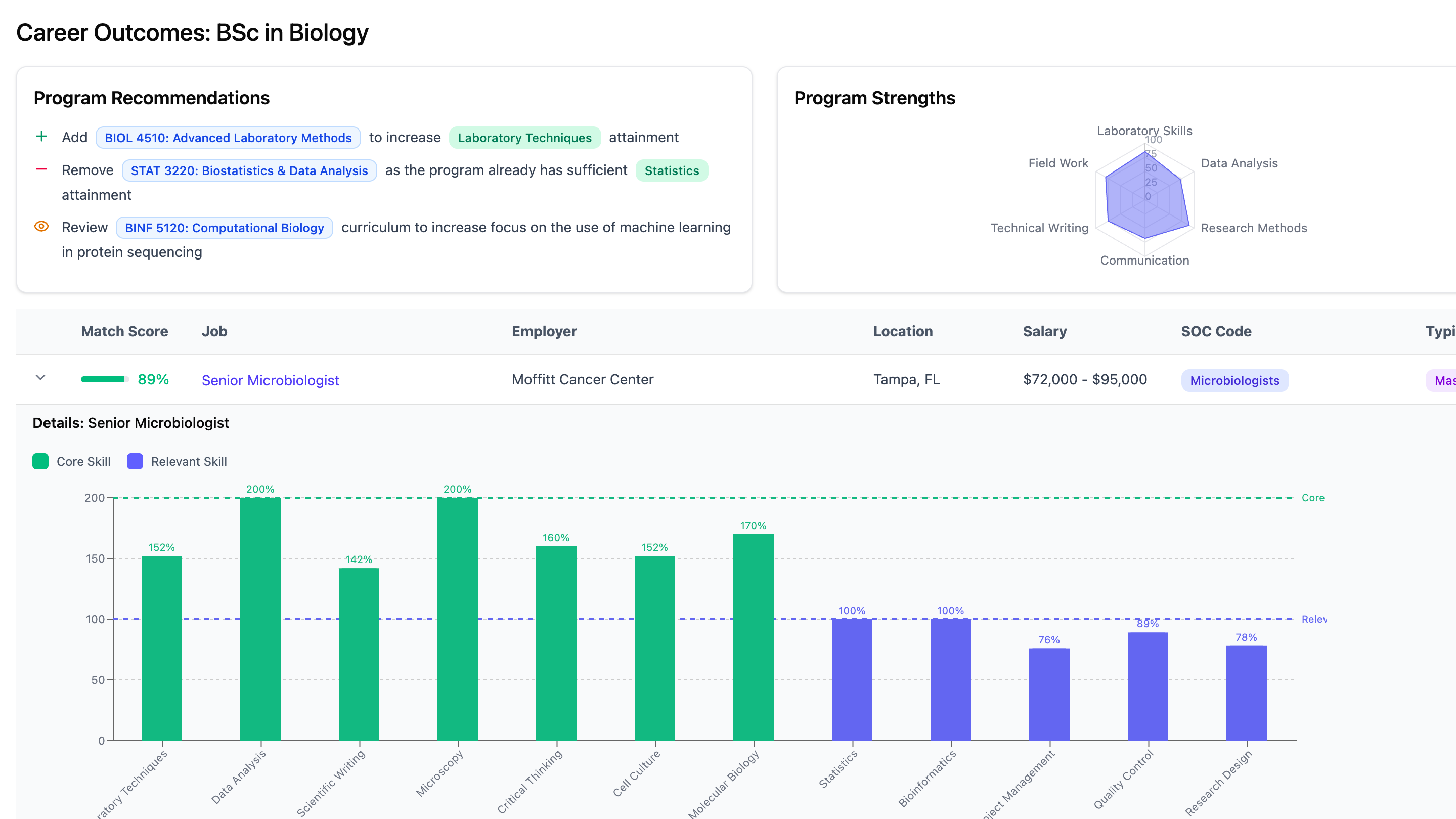
- 1Actionable recommendations
Program recommendations to improve career outcomes with fact-based justifications
- 2Strength concentration
Quickly understand the areas your program excels in
- 3Occupation and Job Alignment
Get a visual list of occupations and jobs ranked on how well they match your program's skills
- 4Skills attainment and gaps
Easily visualize how your program stacks up against occupations and real jobs
See the infrastructure behind skills-based curriculum review.
From extraction to gap analysis to structured workflow, explore the components that power skills-driven curriculum improvement.
Skills Extraction & Translation
Translate courses and programs into structured, comparable skills profiles.
Skills Extraction & TranslationMatching & Alignment
Compare curriculum skills to target careers, workforce demand, or standards.
Matching & AlignmentSkills Intelligence Workspace
Explore strengths, gaps, and alignment across programs with reusable reports and dashboards.
Skills Intelligence WorkspaceCurriculum to Careers
Connect curriculum improvement directly to career alignment and workforce demand.
Curriculum to CareersMake curriculum improvement skills-driven.
See how your courses and programs translate into strengths, gaps, and actionable updates - all backed by a shared skills framework.